Photography captures not just moments but moods, with color palettes evolving to reflect cultural shifts toward comfort, vibrancy, and introspection. Pantone’s announcement of Mocha Mousse as the Color of the Year—a rich, warming brown evoking indulgence and earthiness—sets the tone for nuanced earth tones dominating shoots from portraits to landscapes.
Meanwhile, broader trends pull from Pinterest’s playful primaries and Vogue’s soft summer spectrum, blending bold saturations with minimalist neutrals. This article explores these influences, their applications in genres like wedding and editorial work, and post-processing techniques to achieve pixel-perfect harmony in tools like Lightroom and Photoshop.
Pantone’s Mocha Mousse: The Anchor of Earthy Elegance
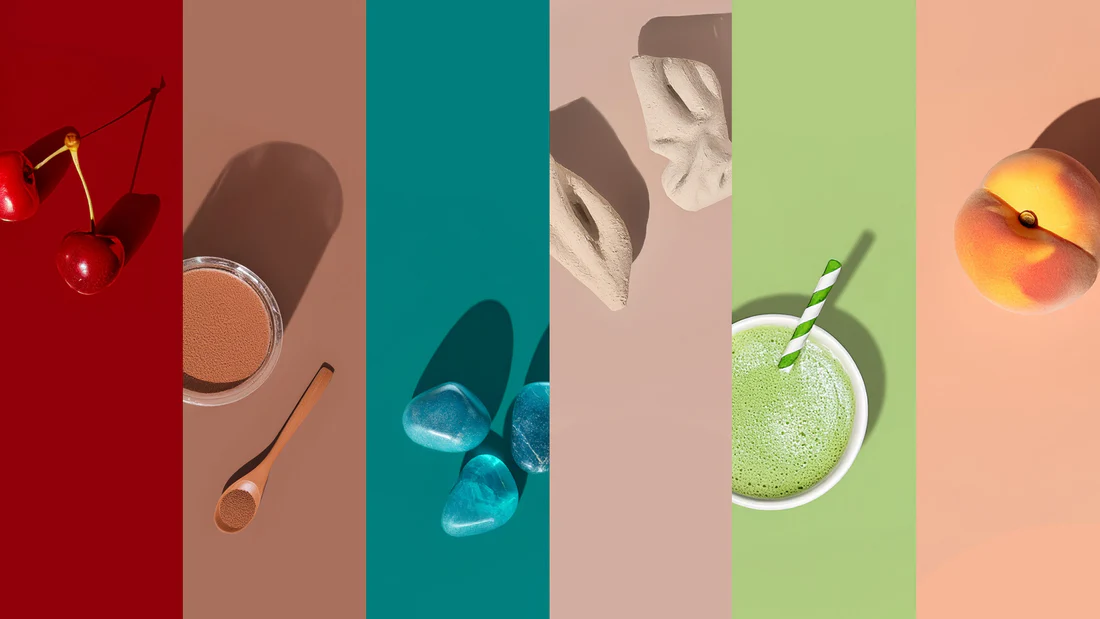
Pantone 17-1230 Mocha Mousse, a muted red-orange brown reminiscent of coffee grounds and chocolate, embodies 2025’s craving for nurturing warmth. In photography, this hue grounds compositions, pairing seamlessly with terracotta accents for autumnal portraits or as a subtle vignette in urban street scenes. Its sensorial appeal—suggesting comfort amid global uncertainties—lends itself to lifestyle imagery, where it tempers brighter elements without overwhelming.
Photographers are incorporating it via selective desaturation: Shoot in golden hour to naturally infuse mocha undertones, then amplify in post for a cohesive, indulgent feel. Early adopters in brand photoshoots note its versatility, elevating neutral backdrops into sophisticated narratives. Expect this trend to ripple into product photography, where mocha-infused shadows add depth to minimalist still lifes.
Vibrant Boldness Meets High-Contrast Drama
Countering the subtlety of earth tones, 2025 heralds a surge in saturated, high-contrast colors that demand attention. Cherry Red from Pinterest’s palette injects energy into event coverage, while Aura Indigo provides moody depth for editorial portraits. Vogue highlights Butter Yellow and Wispy Pink for airy, optimistic vibes in fashion spreads, evoking dawn-lit florals or sunset silhouettes.
In practice, these trends favor dynamic lighting setups: Use LED gels for targeted pops of Dill Green in macro florals or Crisp Blue Cotton for coastal landscapes. The result? Images that pop on social feeds, where algorithms reward visual punch—boosting shares by up to 20% in vibrant compositions. For weddings, true-to-life edits preserve these hues’ authenticity, aligning with a shift toward candid, color-true documentation over heavy stylization.
Neutrals and Pastels: The Soft Counterpoint
Not all trends roar; 2025 also embraces restraint with neutrals like Alpine Oat and soft beiges for a calming, aesthetic minimalism. These serve as canvases in lifestyle photography, allowing subjects to breathe amid serene backdrops—think fog-shrouded forests or linen-draped interiors. Moody Plum adds a whisper of drama, ideal for low-key portraits that evoke introspection.
Editing tip: Layer neutrals with subtle grain for a filmic texture, mimicking analog warmth without dated filters. This approach suits documentary work, where over-saturation can distract from narrative depth, and supports accessibility by ensuring high readability in print proofs.
Pixel-Perfect Edits: Bringing Trends to Life in Post
Translating these palettes from concept to capture requires precise post-processing. Start in-camera with custom white balance to lock in tones, then refine in Lightroom: Use the Color Wheel for harmonious shifts, ensuring Mocha Mousse complements yellows without clashing.
For advanced control, Photoshop’s Neural Filters offer quick mood matches, but custom palettes elevate results. When brainstorming schemes inspired by a shoot’s theme—like a cherry-red festival or oat-toned retreat—an ai generated color palette tool can instantly suggest complementary hues, pulling from Pantone data or image uploads to maintain cohesion across a series. Export these as .ase files for seamless import, saving hours on manual sampling.
Pro workflow: Calibrate your monitor first, then batch-apply adjustments via actions—targeting skin tones to avoid unnatural shifts in diverse subjects. Trends like true-to-color editing underscore restraint: Aim for +5-10% vibrancy boosts max, preserving the scene’s emotional truth.
Embracing 2025: Sustainability and Innovation in Color
Beyond aesthetics, these trends nod to sustainability—earth tones like Mocha Mousse echo eco-conscious narratives, while vibrant palettes highlight diverse, inclusive representations. Photographers are experimenting with AI-augmented shoots for predictive color mapping, blending Pantone foresight with on-site adaptability.