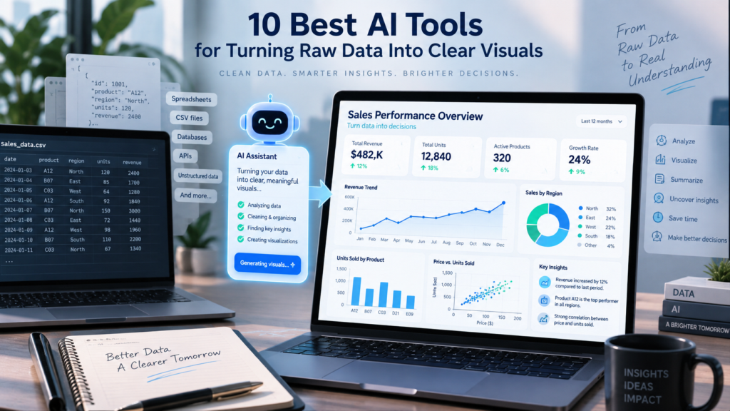
A good AI chart tool does more than plot. It picks the right chart, keeps the baseline honest, and highlights the point you are making instead of colouring every bar.
What AI data visualization tools do
These tools use machine learning and natural language to move from a table to a picture without manual chart building.
Three jobs come up again and again. First, they read messy data and clean it enough to plot, so stray headers, text stored as numbers, and mixed date formats do not stop you. Second, they choose a sensible chart for the shape of the data, such as a line for time, bars for categories, and a share of a total for parts of a whole. Third, they let you ask for what you want in plain language and adjust by asking again rather than by editing menus.
The category splits into two broad types. Single chart and conversational tools take a file or a prompt and hand back a figure or a quick analysis. Full business intelligence platforms connect to live data sources and build governed dashboards that refresh on their own. Both are useful, and they solve different problems, which is worth keeping in mind as you read.
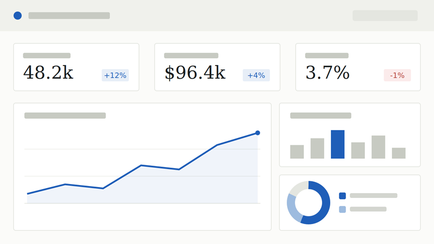 A typical dashboard built by a BI platform: summary figures, a trend over time, a category breakdown, and shares of a total, all on one refreshing page.
How these tools were chosen
Each tool on this list earns its place on four practical measures:
Output quality: Charts and dashboards are readable by default, with honest baselines and clear labels.
Ease of use: A non-technical person can get a result without writing code or learning query syntax.
Data handling: The tool accepts real inputs, from pasted tables and CSV files to connected databases.
Fit for a job: Each one is genuinely better than the others at a specific task, rather than a copy of the same idea.
The list runs from broad enterprise platforms to focused, single purpose makers. Higher on the list does not mean better for you. It means broader reach. Read the best-for line under each tool, since that is where the real recommendation sits.
The 10 best AI tools
1. Microsoft Power BI
Governed dashboards for the Microsoft stack, with a Copilot assistant.
Power BI is a full business intelligence platform that connects to live data and builds interactive reports. Its Copilot assistant turns a plain request into a report page, writes DAX measures, and produces a written summary of what a chart shows. It sits naturally alongside Excel, Teams, and the wider Microsoft data stack, which makes it a default choice for companies already there.
In practice you connect Power BI to a source once, model the relationships between your tables, and then build report pages that anyone with access can open and filter for themselves. Copilot shortens the slow parts: you can ask it to create a page about a topic and it drafts the visuals plus a short written readout you can edit. Because reports refresh on a schedule, the same dashboard stays current without being rebuilt, which is the main reason large organisations standardise on it. The trade-off is that the modelling step rewards a little training, and the stronger AI and sharing features sit behind a paid Pro or Fabric tier.
Best for: Teams inside the Microsoft ecosystem that need governed, refreshing dashboards.
Watch for: Real value needs data modelling and a paid tier. The learning curve is real for first-time analysts.
2. Tableau
Deep visual analytics with AI-assisted exploration.
Tableau, part of Salesforce, is built for exploratory analysis and highly interactive dashboards. Its AI layer suggests visualizations, explains what is driving a number, and drafts calculations from a plain description. It rewards analysts who want fine control over how a chart looks and behaves, and it scales from a single workbook to an organisation-wide deployment.
You work by dragging fields onto a canvas and watching the chart update, which suits people who like to explore visually rather than describe what they want in words. The AI layer speeds that loop by proposing suitable charts, drafting calculated fields from a plain description, and flagging what is driving a spike or a dip. Because it scales from one person’s workbook to a governed server deployment, a chart you sketch alone can become a shared, permissioned dashboard later without starting over. That range is both its strength and its cost, since the depth analysts value also makes it slower to pick up than a chat-first tool.
Best for: Analysts building rich, interactive dashboards where design control matters.
Watch for: Heavier to learn than a chat-based tool, and pricing sits at the premium end.
3. ChartGPT
Describe a chart or paste a table, and get a presentation-ready figure in seconds.
ChartGPT is the most direct route from numbers to a finished chart. You paste a range out of Excel or Sheets, upload a CSV, or simply type the values into a sentence, and it reads the data, picks a sensible chart, and draws it with good practice already applied. Bars start at zero, rankings are sorted, one series gets one colour, and the title states the finding rather than naming the axes. It covers nine chart types, including bar, line, pie, donut, area, and scatter, and asks a question when a column is ambiguous instead of guessing quietly.
When the chart is ready, you export it as PNG for a quick paste, SVG for a slide that will be projected, or PDF for print, and you can copy the full chart specification as JSON to rebuild it elsewhere. There is no sign-up needed to try it, nothing you paste is stored, and your data is not used to train a model. That combination makes it a strong pick for consultants, founders, marketers, and students who need one clean chart now, not a full analytics deployment.
Best for: Anyone who needs a single, clean, export-ready chart for a deck, report, or post fast.
Watch for: It makes individual charts, not live dashboards from connected sources, and colours and the axis range are set automatically.
4. Julius AI
A conversational data analyst for your own files.
Julius acts like an analyst who reads your spreadsheet and answers on the spot. Upload a CSV, Excel file, Google Sheet, or PDF, ask a question in plain English, and it returns the answer with a chart chosen to match, whether that is a bar chart, a line graph, a scatter plot, or a heatmap. It also runs real statistics and forecasts, and its reusable notebooks let you save an analysis once and rerun it on next month’s data.
Under the hood it writes and runs actual code, so beyond simple charts it can handle regression, ANOVA, and other statistical work, and build a forecast from historical figures. It keeps context across a session, which means you can switch from one file to another and keep asking follow-up questions without re-explaining your goal. The notebooks are the feature power users lean on: you assemble an analysis once, with cells for your data, your questions, and inputs like a date range, then rerun the whole workflow on fresh data each month. It is deliberately an analysis surface rather than a monitoring one, so pair it with a BI platform when you need a dashboard that updates on its own.
Best for: Ad-hoc exploration and one-off analysis of files you already have.
Watch for: It is built for exploration, not live dashboards, and lower tiers have file size and retention limits.
5. ThoughtSpot
Search-driven analytics for whole teams.
ThoughtSpot lets business users type a question the way they would in a search box and get an instant chart or dashboard back from governed company data. Its AI layer, Sage, handles the natural language step, so a sales lead or an operator can explore numbers without waiting on an analyst. It is designed for self-service at scale, where many non-technical people need answers from the same trusted model.
The experience is closer to a search engine than a report builder: you type a question, it returns a chart, and you refine by asking again. Sage, the AI layer, interprets the question and can also explain a result in plain words, which lowers the barrier for people who would never open a traditional BI tool. Behind that simple box sits a modelled semantic layer that an analytics team maintains, and the quality of the answers depends on how well that model is built. That is why it performs best in larger organisations, where many non-technical people need trustworthy answers drawn from the same governed definitions.
Best for: Large teams that want plain-language, self-service analytics on shared data.
Watch for: It is enterprise-oriented and needs a well-built data model to perform.
6. Polymer
Automatic dashboards for marketing and e-commerce data.
Polymer turns a spreadsheet or a connected marketing source into an interactive dashboard with very little setup. It plugs straight into the platforms marketers use every day, including Google Ads, Facebook Ads, Shopify, and Google Sheets, then builds views and surfaces patterns on its own. For a team that wants a working dashboard the same afternoon, it removes most of the usual configuration.
Point it at a spreadsheet or connect a source, and it infers the structure of your data and assembles a dashboard you can filter and share, often within minutes. Because it leans on the platforms marketers already run, there is little of the modelling work a full BI tool expects, which is the whole appeal for a lean team without an analyst. The flip side is that it is tuned for the marketing and e-commerce shape of data, so highly custom enterprise models or strict governance requirements are better served by one of the heavier platforms above.
Best for: Marketing and e-commerce teams wanting quick dashboards without a BI project.
Watch for: Less suited to heavy custom modelling or complex enterprise governance.
7. Akkio
No-code prediction, then visualization of the result.
Akkio starts one step earlier than most tools on this list. It is a no-code platform for building predictive models, such as lead scoring, churn forecasts, and classification, and then presenting the results as charts and white-label reports you can brand and share with a client. Its strength is turning historical data into a forecast, not just describing what already happened, which makes it a natural fit for agencies and operations teams.
You connect your data, state the outcome you want to predict, such as which leads will convert or which customers may leave, and it trains a model and returns the forecast without any code. The results come out as charts and white-label reports you can brand and hand straight to a client, which is why agencies favour it for repeatable reporting. It is best understood as a complement to the descriptive tools on this list rather than a replacement: use something like Julius AI or ChartGPT to understand what happened, then Akkio to project what comes next. Check the plan tiers before committing, since the predictive features step up in price.
Best for: Agencies and ops teams that want predictions plus client-ready reporting.
Watch for: Its focus is prediction rather than deep dashboard design, and pricing steps up quickly.
8. Qlik Sense
Flexible enterprise analytics built on an associative engine.
Qlik Sense is a scalable analytics platform whose associative engine lets people explore data freely across many sources rather than following predefined paths, which often surfaces relationships a fixed query would miss. It adds AI-generated insights and natural-language interaction on top, and it can run in the cloud, in a private cloud, or on premises, which matters for organisations with strict data rules.
The associative engine is the thing that sets it apart. Rather than following a fixed path from a query, you can click any value and the whole model recalculates to show what is related and, just as usefully, what is not, which surfaces connections a predefined report would hide. On top of that it layers AI-generated insights and a natural-language question box for people who prefer to ask rather than click. Deployment flexibility is the other draw, since the same product runs in the cloud, a private cloud, or on premises. The associative way of thinking takes a little time to settle in, and the pricing is aimed at the enterprise.
Best for: Enterprises needing flexible, scalable analytics with deployment control.
Watch for: The associative model takes time to learn, and pricing is enterprise-grade.
9. Domo
An end-to-end cloud platform with AI agents.
Domo bundles data integration, dashboards, and AI into a single cloud platform, so the pipeline from raw source to shared visualization lives in one place. Its AI agents help build visualizations and explain what a dashboard is showing, and its large library of connectors pulls data together without a separate integration layer. It suits companies that want the whole workflow under one roof rather than a stack of separate tools.
The pitch is one roof for the whole journey: connectors pull data in, transformations shape it, dashboards present it, and AI agents help build and explain the visualizations, all inside the same cloud product. That removes the seams between separate integration, modelling, and reporting tools, which appeals to companies that would rather not stitch a stack together themselves. The cost of that breadth is that Domo is a large platform to adopt and run, so for a small team that only needs a handful of charts it can be more than the job requires.
Best for: Companies wanting integration, dashboards, and AI in one cloud platform.
Watch for: It is a broad platform, so cost and complexity can be high for small teams.
10. Zoho Analytics
Affordable self-service BI with an AI assistant.
Zoho Analytics brings self-service dashboards within reach of smaller budgets. Its AI assistant, Zia, answers questions in plain language, suggests suitable charts, and drafts reports, while a wide connector range pulls in data from common business apps. It is a sensible entry point for small and mid-size businesses that want capable reporting without enterprise pricing or a dedicated data team.
You import data from files or from a wide set of connected business apps, and Zia, the AI assistant, helps by answering questions in plain language, recommending a chart type, and drafting reports you can refine. It fits comfortably into the wider Zoho suite while also working on its own, and its pricing keeps self-service reporting within reach of a small team. On very large or intricate datasets it will not match the depth of the top enterprise platforms, but for everyday business reporting that ceiling rarely gets in the way.
Best for: Small and mid-size businesses wanting capable BI at a lower price.
Watch for: Less advanced than top-tier platforms on very large or complex datasets.
Comparison table
A quick side-by-side of six representative tools across the questions people ask first.
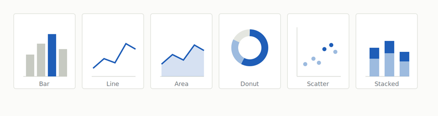
The common chart types these tools generate. The right choice depends on the shape of the data: trends over time, comparisons across categories, or shares of a whole.
| Tool | Type | Best for | Main output | Learning curve |
| Power BI | BI platform | Microsoft teams | Live dashboards | Moderate to high |
| Tableau | BI platform | Analysts | Interactive dashboards | Moderate to high |
| ChartGPT | Single chart maker | Fast, clean charts | Exportable single charts | Very low |
| Julius AI | Conversational analyst | Exploring your files | Charts and analysis | Low |
| Polymer | Auto dashboard | Marketing teams | Connected dashboards | Low |
| Akkio | Predictive analytics | Forecasting | Predictions and reports | Low to moderate |
How the tools differ
The names blur together until you see where the real lines fall. Two differences matter most when you pick.
Single chart makers versus full BI platforms
ChartGPT, and to a degree Julius AI, are built to hand you one finished artefact from data you already have. You paste or upload, you get a chart, you export it, and you are done in under a minute. Power BI, Tableau, Qlik Sense, and Domo work the other way round. You connect them to a live source once, then they refresh governed dashboards on a schedule for many viewers. The first type wins on speed for a single figure. The second wins when the same numbers need to stay current for a whole team over months. Reaching for a BI platform to make one chart for a slide is heavy, and expecting a single chart maker to run a live company dashboard asks it to do a job it was never built for.
Describing the past versus predicting the future
Most tools here are descriptive. They show what the data already says, in Julius AI, ChartGPT, ThoughtSpot, Polymer, and the BI platforms. Akkio is the outlier, because its core job is predictive: it builds a model from historical data and projects what is likely to happen next, then visualizes that forecast. If your question is what happened last quarter, a descriptive tool is the right and faster answer. If your question is what will happen next quarter, a predictive tool like Akkio is doing something the others are not designed to do.
How to choose the right one
Match the tool to the job in front of you rather than to the longest feature list.
You need one clean chart for a deck now. Start with ChartGPT. Paste the numbers, describe the chart, export the file.
You want to interrogate a spreadsheet. Use Julius AI to ask questions and get charts and statistics back in a chat.
You live in the Microsoft stack. Power BI with Copilot fits your existing tools and permissions.
You need many people to self-serve. ThoughtSpot or Qlik Sense give governed, plain-language exploration at scale.
You run marketing or e-commerce. Polymer connects your ad and store data and builds dashboards quickly.
You need a forecast, not a recap. Akkio builds predictive models and turns them into client-ready reports.
You want capable BI on a budget. Zoho Analytics offers self-service reporting without enterprise pricing.
Final word
There is no single best tool, only the best fit for the task and the team. The enterprise platforms near the top of this list reward the time you invest in them with governed, always-current dashboards. The focused tools lower down give you a clean result in seconds with almost no setup. Most people end up using both at different moments, reaching for a single chart maker like ChartGPT when a slide is due tomorrow and a full platform when a dashboard has to live for a year.
Whichever you choose, the aim is the same. Turn a table nobody wants to read into a picture that makes its own point, and let the tool handle the plotting so you can spend your attention on the argument.