
A streaming app is often judged by the size of its catalogue. That tells a viewer something about choice, but very little about the effort required to enjoy it. Search results, language settings, playback controls and device support all affect what happens between opening an app and finishing an episode.
For software teams, entertainment apps offer a useful way to examine usability. The task sounds straightforward: help someone find a video and watch it. In practice, the experience spans discovery, installation, account access, network conditions and different screen sizes. A small obstacle at any stage can interrupt the session.
Looking at these stages separately gives readers a more practical way to compare apps. It also gives product teams specific questions to investigate, without assuming that a long feature list translates into an effortless experience.
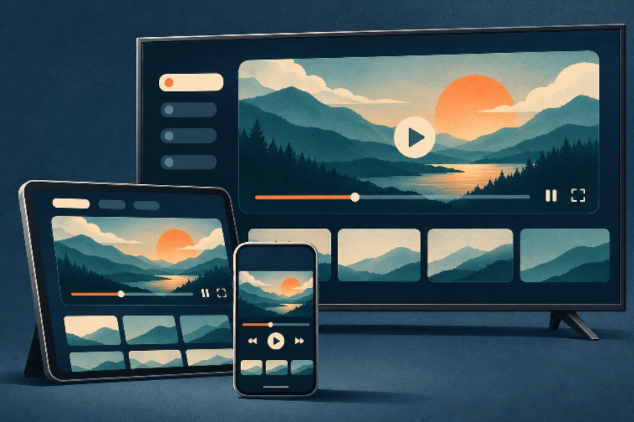
Different devices require different layouts and controls. Conceptual illustration.
Discovery starts with understandable choices
Consider two common situations. One viewer knows the exact title they want. Another has twenty minutes available and wants something suitable for that time. A useful interface should offer a clear route for each person.
For the first viewer, search needs enough detail to distinguish productions with similar names. Release years, descriptions and season information can prevent unnecessary detours. For the second, browsable categories and useful descriptions make exploration less demanding. An endless row of posters leaves much of that work to the viewer.
Saved lists and viewing history deserve the same attention. Someone returning after a few days should be able to locate an unfinished episode without repeating the original search. These are ordinary interactions, but they provide concrete evidence of whether an app is easy to live with.
Language support extends beyond translated menus
A translated interface is a starting point. Viewers also need to understand which audio tracks and subtitles are available for an individual title. Those details are most useful before playback begins, especially when several people are choosing something to watch together.
Brazilian audiences provide a relevant example. A viewer may prefer Portuguese dubbing for family viewing and original audio with subtitles for a different programme. Clear language information makes that choice easier. Search terms and category names also need to make sense to the people using them.
The Portuguese-language guide for Cinegato brings together information about content categories, interface language and installation on Android devices. For someone researching an entertainment app, that combination is useful because it connects the viewing experience with the practical steps needed to get started.
The wider design lesson is to explain language options where decisions happen. A language selector buried in settings cannot answer every question a viewer has while comparing titles.
Different screens require different controls
A phone is held close to the viewer and operated by touch. A television is viewed from farther away and commonly controlled with directional buttons. Those differences change how navigation should work. Text that looks comfortable on a handset may be difficult to read across a room.
On a television, viewers need an obvious indication of which item is selected and a predictable route back to the previous screen. On a phone, touch targets and controls should remain usable without covering too much of the video. Simply enlarging the same interface does not resolve every difference.
The device guidance on YouCine discusses using an entertainment app across Android phones, compatible televisions and computers through an Android emulator. It illustrates why compatibility information matters alongside content information: the device a viewer owns determines which installation path they need to investigate.
When comparing apps, check the operating system and input method for the intended device. A smart television label alone does not establish Android compatibility. Likewise, running a mobile app through an emulator is a different setup from installing a native desktop application.
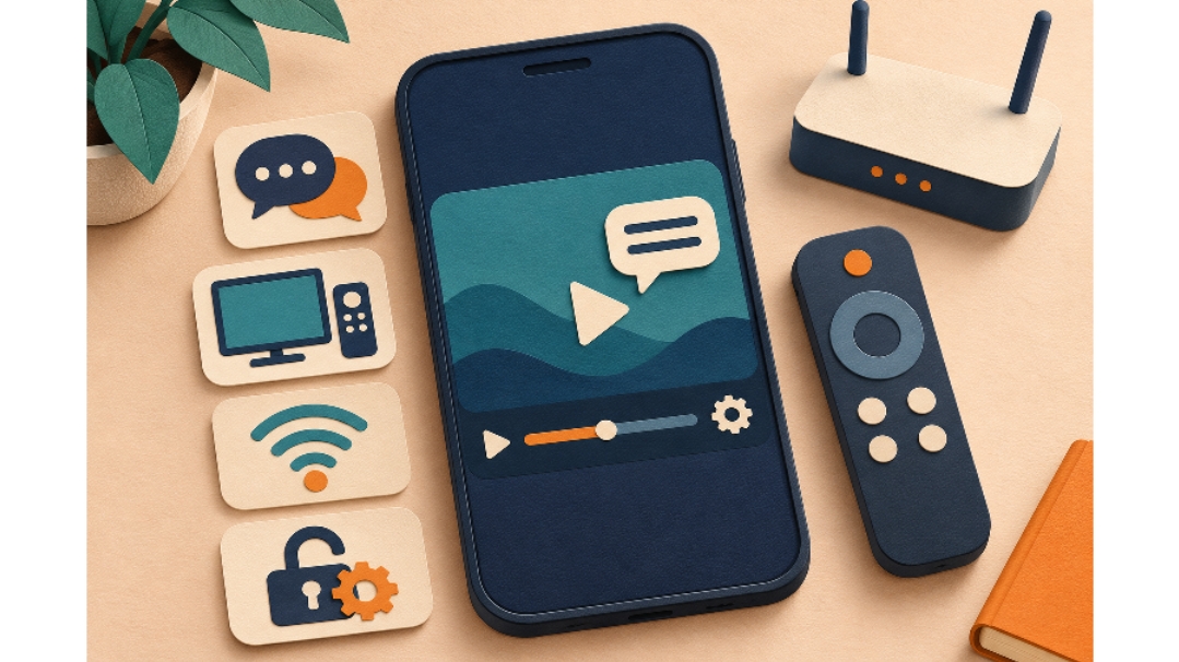
Language, controls, connectivity and settings all contribute to the viewing experience. Conceptual illustration.
Playback depends on more than the resolution label
A high-resolution option tells only part of the story. Playback also depends on the connection, the device and the delivery of the selected video. A viewer needs accessible controls when those conditions change, rather than a promise that buffering will never happen.
Manual quality selection can be useful when a connection becomes unstable or data usage matters. Subtitle and audio controls should also be easy to locate during playback. If adjusting a setting requires abandoning the video, the interface adds friction at exactly the moment someone wants to keep watching.
Error messages are another opportunity to help. An explanation that distinguishes a connection issue from an unavailable title gives the viewer a reasonable next step. A generic failure screen provides little guidance and can lead people to repeat actions that do not address the cause.
Installation and maintenance belong in the experience
The experience begins before the first video. Viewers need to know which devices an app supports, where it is distributed and how updates are handled. When an app uses an APK installation process, the instructions should explain the required Android permissions and the appropriate package for the device.
Useful documentation also distinguishes temporary files from account information and saved preferences. People should understand the likely effect of a troubleshooting action before following it. Clear update notes can help them decide whether a new release addresses the problem they encountered.
Product information should be specific about subscriptions, advertisements and feature availability. A downloadable app may still have paid options, while a listed feature may depend on a particular device or account. Explaining those conditions early helps readers form realistic expectations. Content availability and viewing rights can also differ by location and service.
Compare apps through a realistic viewing session
A practical comparison can follow a short sequence: find a title, check its language options, start playback, adjust one setting, then return to the title later. Repeat the relevant steps on the screen you expect to use most. This reveals more about everyday convenience than comparing feature names alone.
For developers, each step is a focused usability question. Can people identify the correct title? Can they tell what the app supports? Can they recover from an interruption? Observing those tasks can uncover confusing labels, hidden controls and incomplete guidance that a feature checklist misses.
Streaming apps make the relationship between software design and everyday habits easy to see. Clear discovery, understandable language choices and suitable device controls help people spend less effort managing the interface. Those are useful standards for evaluating entertainment software, and practical priorities for the teams building it.