
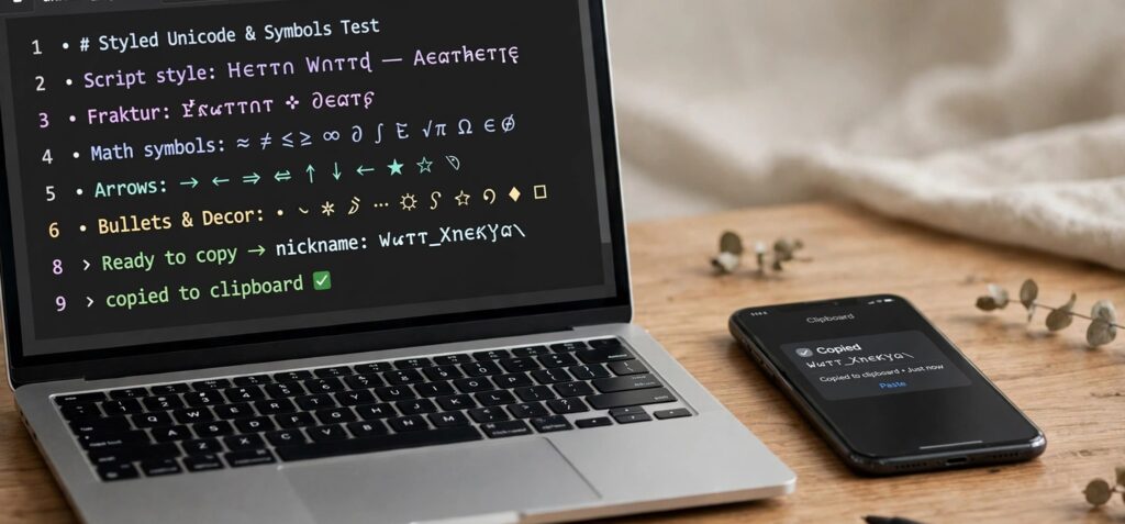
Two names can look almost identical on a screen and behave differently after someone pastes them into a form. One is made from ordinary letters. Another uses decorative Unicode characters. A third includes a blank-looking character between words. To the reader, all three might seem like small typographic variations. To the software receiving them, they are different strings.
That distinction matters whenever text moves between a browser, social profile, game, contact form, or publishing system. A name may look excellent in a preview yet become difficult to search, exceed an unexpected character limit, or lose its spacing in the final field. Instead of asking whether a text style “works everywhere,” a better question is: what should we check before using it in a particular place?
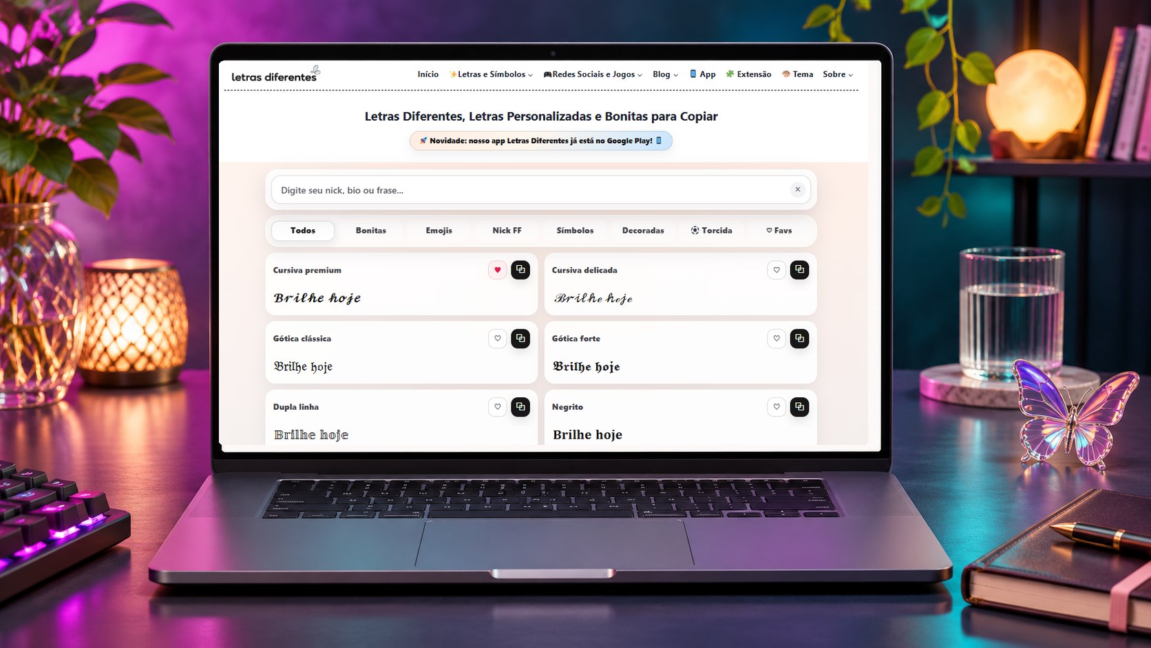
The genuine Letras Diferentes Online homepage is shown inside an editorial laptop scene.
The difference between how text looks and what it contains
A traditional font changes how an application draws characters. Apply a bold typeface to “Studio Aurora” in a design editor, for example, and the underlying letters can remain ordinary Latin characters. A copy-and-paste text generator often takes a different route: it substitutes Unicode characters with letter-like shapes. The visual change travels with the copied string because the characters themselves are different.
Consider three examples, presented here for illustration:
Plain: Studio Aurora
Decorative bold: 𝗦𝘁𝘂𝗱𝗶𝗼 𝗔𝘂𝗿𝗼𝗿𝗮
With a non-obvious separator: Studio[U+3164]Aurora
The square-bracketed notation in the third example identifies a code point; it is deliberately shown as a label rather than hiding the character in this article. U+3164 is HANGUL FILLER, a real Unicode character that can create an empty-looking position in some displays. It is not identical to an ordinary keyboard space.
Different characters can also have different consequences for search, validation, line wrapping, character counts, and assistive technology. None of those outcomes is guaranteed by the appearance of a preview alone.
A practical first test with a browser-based lettering generator
A useful way to begin is to keep the words fixed and change only their visual form. The browser-based letras diferentes generator lets readers enter a nickname, bio, or short phrase and compare styled results on the same page. Its real interface includes categories such as Todos, Bonitas, Emojis, Nick FF, Símbolos, and Decoradas, with copy controls alongside results.
Try the following procedure with an ordinary, non-sensitive sample phrase such as “Studio Aurora”:
1. Write down the original phrase. Keep a plain-text version available before experimenting.
2. Enter it in the generator. Compare a restrained style with a more decorative one rather than changing the wording between comparisons.
3. Copy a single result. Use the copy control beside the version you want to test.
4. Paste into a temporary field. A notes app or an unsent draft is safer than immediately changing a public account name.
5. Inspect the result. Read every letter, check accents and spacing, and try copying it back into a plain-text field.
This exercise demonstrates how to evaluate a candidate string. It does not establish compatibility with any particular app or game. A published field may impose different validation rules from the generator preview or the temporary note.
“Invisible space” can refer to several different characters
One easy mistake is treating all blank-looking characters as interchangeable. They aren't. The site's caractere invisível tool (Portuguese for “invisible character”) currently provides three ready-to-copy presets: Grande, Médio, and Pequeno. The interface identifies them as U+3164, U+2000, and U+205F respectively. These are different code points, not three visual sizes of the same character.
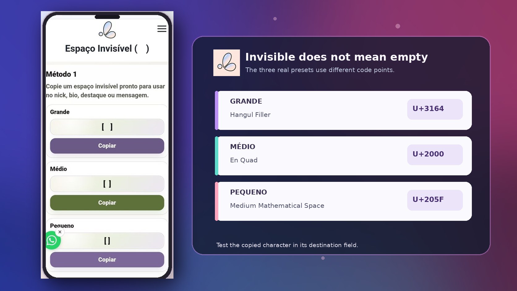
Actual mobile tool interface paired with an editorial code-point comparison.
| Tool label | Unicode value | What the character is |
|---|---|---|
| Grande | U+3164 | HANGUL FILLER |
| Médio | U+2000 | EN QUAD |
| Pequeno | U+205F | MEDIUM MATHEMATICAL SPACE |
| Different concept | U+200B | ZERO WIDTH SPACE (not one of the three presets) |
The distinction between a blank-looking character and a zero-width character is important. A character can occupy advance width without displaying an inked glyph. Conversely, zero-width controls can affect text behavior without taking up conventional visual space. These categories should not be conflated.
The invisible-character page also offers a quantity selector and a place to paste a character for checking that something was copied. Those functions help with preparation; they still cannot tell a reader whether a specific profile, game, or form will permit it.
For a decorative nickname or a non-essential heading, experimenting may be reasonable. For an account identifier, purchase reference, payment instruction, telephone number, or URL, invisible characters introduce avoidable ambiguity. Ordinary spaces and conventional characters are better defaults.
The six checks that matter after copying styled text
A quick visual inspection is necessary, but it is not a complete compatibility test. Use the following sequence whenever the copied text matters beyond a one-off message.
1. Check actual rendering, not the generator preview
Paste the text where it will be used. Does a character turn into an empty square? Does a symbol sit too high or low? Does the phrase wrap unexpectedly on a narrower screen? If the destination changes the result, simplify the string. The destination field is the relevant test environment.
2. Confirm the field accepts and saves it
A field that allows pasting may still reject the value when you press Save. A display-name field and an @username field may enforce different rules. Treat a successful paste and a successful saved result as separate observations. Don't assume that acceptance on one platform predicts acceptance on another.
3. Check accents and language-specific characters
Stylized alphabets do not always provide convenient matches for every accented Latin letter. If a Portuguese word such as “ação” or “coração” loses an accent or cedilla during substitution, keep that word in ordinary text. Correct spelling is more useful than a uniformly decorative appearance.
4. Compare character counts carefully
A displayed symbol does not always correspond to one unit in every counting system. Software may count Unicode code points, UTF-16 code units, or user-perceived characters differently. Emoji sequences and combining marks make this distinction especially visible. The count shown by one editor is not a universal promise about another editor's limit.
5. Consider reading, copying, and searching
If the name needs to be found by customers, colleagues, or teammates, keep a conventional spelling somewhere accessible. Decorative alphabets may be pronounced differently by screen readers, and lookalike characters may not match an ordinary-text search. A visually impressive name can be a poor identifier.
6. Keep a clean original and a rollback option
Save the ordinary phrase next to the decorated version. If a field strips characters or an app updates its validation, you can return to the baseline immediately. For a professional profile, this small habit matters more than collecting dozens of variations.
A compact troubleshooting matrix
When something goes wrong, identify the symptom before changing the style again.
| Symptom | Possible reason | First action |
|---|---|---|
| Styled letter appears as a square | Missing glyph support | Try a simpler style or ordinary letters |
| Name pastes but fails to save | Destination validation rules | Test the required field using plain characters |
| Blank-looking gap disappears | Trimming or text processing | Try a normal space or a line break |
| Search cannot find a name | Different code points | Keep a conventional spelling |
| Accent or cedilla changes | Incomplete styled alphabet | Keep that word in ordinary text |
| Character limit behaves unexpectedly | Different counting conventions | Check the destination's own limit |
Notice how few of these fixes require a more elaborate generator. Most involve using fewer substituted characters, switching to an ordinary space, or reducing the decorative area to a short heading.
Why normalization does not solve every display problem
Developers sometimes hear that Unicode normalization will make text consistent. There is a useful truth behind that statement, but it needs precision. Unicode defines normalization forms for comparing or processing character sequences. Compatibility forms such as NFKC can fold some styled or compatibility characters toward more conventional representations, while canonical forms such as NFC address a different kind of equivalence.
That does not mean every decorative string should be normalized indiscriminately. A program may need to preserve what a user actually entered for display, apply a separate policy for search, and restrict unusual characters in security-sensitive identifiers. Normalization alone is neither a substitute for input validation nor a guarantee of visual consistency.
The Unicode Consortium documents these issues in Unicode Standard Annex #15 (Normalization Forms) and Unicode Technical Standard #39 (Security Mechanisms). Its security guidance also discusses visually confusable characters: distinct strings that look similar enough to mislead readers. For developers, the practical lesson is to define clear rules for usernames, account names, and identifiers rather than trusting what appears on a screen. For ordinary readers, it means avoiding decorative lookalikes when someone must verify a name or a link.
Where decorative Unicode is useful—and where restraint is smarter
There is plenty of room for experimentation: an optional display-name flourish, an informal gaming nickname, a short community heading, or a creative bio accent can all benefit from a carefully chosen style. The important question is whether people can still read the words and whether a failure would cause inconvenience or confusion.
For an event heading, one decorative word may be enough. For a customer service email address, invoice number, login credential, legal name, or payment destination, use the conventional characters expected by the system. Do not use invisible spacing to disguise a string or bypass a platform's identity rules.
The practical hierarchy is simple: first meaning, then legibility, then compatibility, and only then decoration. You can verify the first three without treating every character style as equally suitable for every field.
Frequently asked questions
Are copy-and-paste fonts actual installed fonts?
Often, no. A browser generator may substitute Unicode characters that resemble specific styles. That is different from installing or selecting a typeface file in a document editor.
Is U+3164 the same as a zero-width space?
No. U+3164 is HANGUL FILLER; U+200B is ZERO WIDTH SPACE. The labels describe distinct Unicode characters with different properties. A blank-looking result should not be assumed to have zero width.
If a styled name works in one app, will it work everywhere?
No. Each app or field may render, validate, normalize, count, or restrict characters differently. Test the exact destination and keep a plain-text alternative.
The best final test is deliberately unglamorous
Before publishing a styled phrase, paste it into its final destination, check the saved result, read it on a smaller screen, and confirm that anyone who needs to find or type it can do so. If an invisible separator or decorative alphabet makes those tasks harder, use the ordinary version.
Good text styling should leave readers noticing the message—not wondering what disappeared between the letters.