
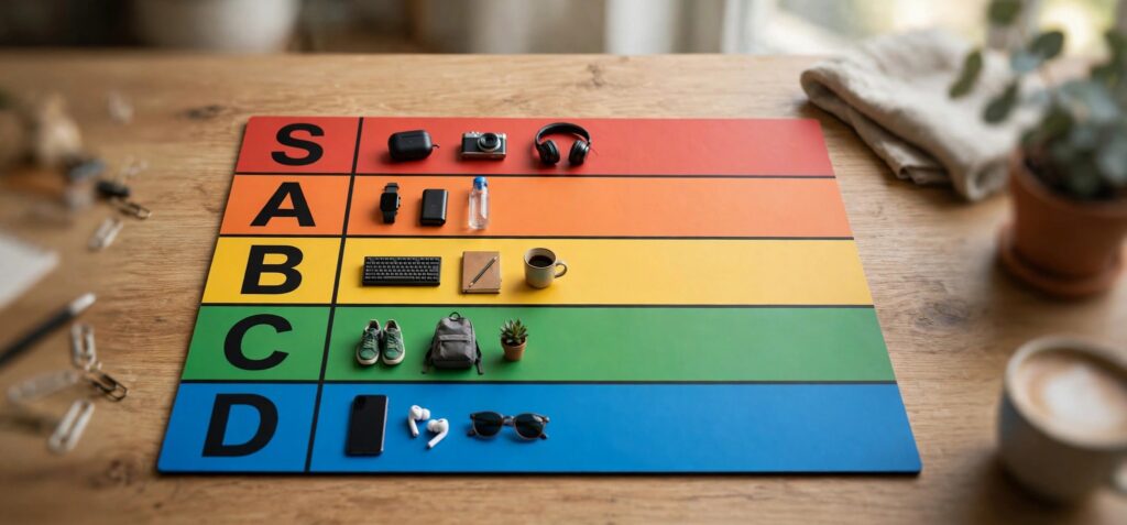
Search for any tier list and you will see the same picture: a stack of rows labelled S, A, B, C and D, coloured red, orange, yellow, green and blue from top to bottom. It is one of the most recognisable layouts on the internet.
It is also a small accessibility lesson, because the colours are carrying information that a meaningful share of viewers cannot read. The problem and the fix both apply well beyond tier lists, to any interface that shows priority, status or severity.
What the colours are doing
The conventional ramp runs warm to cool. Red marks the top tier, and the rows cool through orange, yellow and green to blue. The colours are a convention, not a rule.
Two things about this ramp are worth noticing.
First, it is a rainbow, and a rainbow has no natural order. People learn that red-orange-yellow-green-blue is a sequence; they do not perceive yellow as "more" than green. Compare that with a light-to-dark scale of one colour, which anyone reads as "less to more" without being told.
Second, it puts red and green two rows apart. That is the pair that the most common forms of colour vision deficiency make hard to tell apart.
Who cannot read it
Red–green colour vision deficiency affects roughly 1 in 12 men and about 1 in 200 women of Northern European descent, with lower rates in some other populations. In a group of a few hundred viewers, that is a dozen or more people.
For them, a red row and a green row may look like two similar shades of brownish yellow. The top tier and a lower-middle tier, the most important distinction on the board, become the least distinct.
Colour also fails in situations that have nothing to do with eyesight: a phone at low brightness in sunlight, a black-and-white printout, a screenshot crushed by compression in a group chat.
The rule
The Web Content Accessibility Guidelines put it plainly. Success Criterion 1.4.1, Use of Color, says colour must not be the only visual means of conveying information.
The word that matters is "only". The guideline does not ask you to remove colour. It asks you to make sure the information is still there when the colour is not.
Why tier lists mostly get away with it
A tier list, almost by accident, has two backups.
Position. The top row is the best row. Order on the page carries the whole ranking by itself.
Labels. Each row has a letter. S, A, B, C, D is an ordered sequence that needs no colour at all. (If the letters are new to you, here is what the tier list letters stand for and why S sits above A.)
So a standard tier list passes the "only" test, as long as both backups survive. They often do not. People crop screenshots so that the label column is cut off. They rename the rows to jokes that have no inherent order. They build wide boards where the labels scroll out of view. At that point the colour is doing all the work, and it is the weakest of the three signals.
Five rules for any ranked or status display
These come from fixing this in a real tool, and they transfer directly to dashboards, kanban boards, alert lists and priority tags.
1. Encode rank at least twice
Position plus label. Label plus icon. Colour may be the third signal, never the first. If you removed every colour from the screen, could a new user still tell the best from the worst?
2. Prefer a scale that has a built-in order
A single hue running from dark to light, or a two-hue scale such as blue to orange, reads as a sequence without a legend. Blue–orange is a good default because it avoids the red–green pair altogether.
3. Vary lightness, not only hue
Convert your palette to greyscale. If two levels come out as the same grey, they will be confused by someone, on some screen. Each step should be visibly lighter or darker than its neighbour.
4. Keep the label attached to the thing
A legend in the corner is a memory test. Put the label on the row, the badge or the tile. On a tier list, that means the letter stays on screen when the board scrolls and stays in the frame when the image is exported.
5. Check text contrast on every colour
A white letter on a yellow row is unreadable for everyone. Each background needs a text colour chosen for it, dark on the light rows and light on the dark ones. A ramp that looks handsome as five swatches can fail as five labels.
Testing it in two minutes
You do not need specialist equipment.
- Greyscale. Switch your screen to greyscale, or desaturate a screenshot. Can you still read the ranking?
- Simulate. Browser developer tools include colour vision deficiency emulation. Run through the red–green modes.
- Shrink it. View the design at thumbnail size, as it will appear in a chat preview. Colour blocks survive; small labels may not. If the labels vanish, position has to carry the meaning.
- Crop it. Cut off the label column and ask someone what they are looking at. If they cannot tell, your design depends on a part that is easily lost.
What not to do
Do not respond by stripping the colour out. Colour is a fast, pleasant signal for the majority who can see it, and a grey interface is harder for everyone to scan. The goal is redundancy.
And do not add a "colour-blind mode" toggle as the only answer. A setting that people must find is a setting most will never use. Make the default readable, then offer themes on top.
The wider point
The tier list is a toy example, and it shows the pattern clearly. A design inherits a convention, the convention leans on colour, and the design works for most people most of the time. The failures are invisible to the person who built it.
Red at the top of the board looks like it means "best". It only means that because of where it sits and what is written next to it. Design for the position and the label, and let the colour be decoration that also happens to help.
Farasat Abbas Naqvi is an engineer who builds practical web tools. He created MyTierMaker, a free tier list site.